A landing page is the first web page that leads and customers reach after clicking an online ad, interacting with your email marketing, via social media advertisements, or through search results. While many advertisers use their homepage or existing web pages as landing pages for their online ad campaigns, these aren’t technically considered landing pages.
That’s because great landing pages have a specific goal in mind and are designed – very deliberately – to guide users to take one action. A recent study by Unbounce revealed that landing pages with only one link or call-to-action (CTA) have an average conversion rate of 13.5% compared to pages with five or more links, which have an average conversion rate of 10.5%.
Why are landing pages important?
You have zero control over how your ad appears on a given website, how much your competitors are spending on media, or what ad a user will click on. One thing you have total control over is where you send the people who click on your ads through your online marketing efforts.
Testing your landing pages is the single best way to improve conversion rates for your ad campaigns. Employing a solid landing page strategy is also an excellent way to stand out in an increasingly cluttered digital universe; a high quality, eye-catching landing page template equates to a high converting landing page.
Roughly half of marketers use landing pages in their campaigns; only about 60% of those that do run just five or fewer tests per month. This creates a huge opportunity for proactive marketers to gain an edge over their competitors. You may not have control over your competitors’ budget or impression share, but you can leverage the traffic you’re getting from your ads (and elsewhere) by employing a deliberate and consistent landing page strategy.
What are the elements of a good landing page?
Although every company is unique and each ad campaign has its own specific goals, there are a few standard elements that you should consider implementing when creating your landing pages.
Call To Action
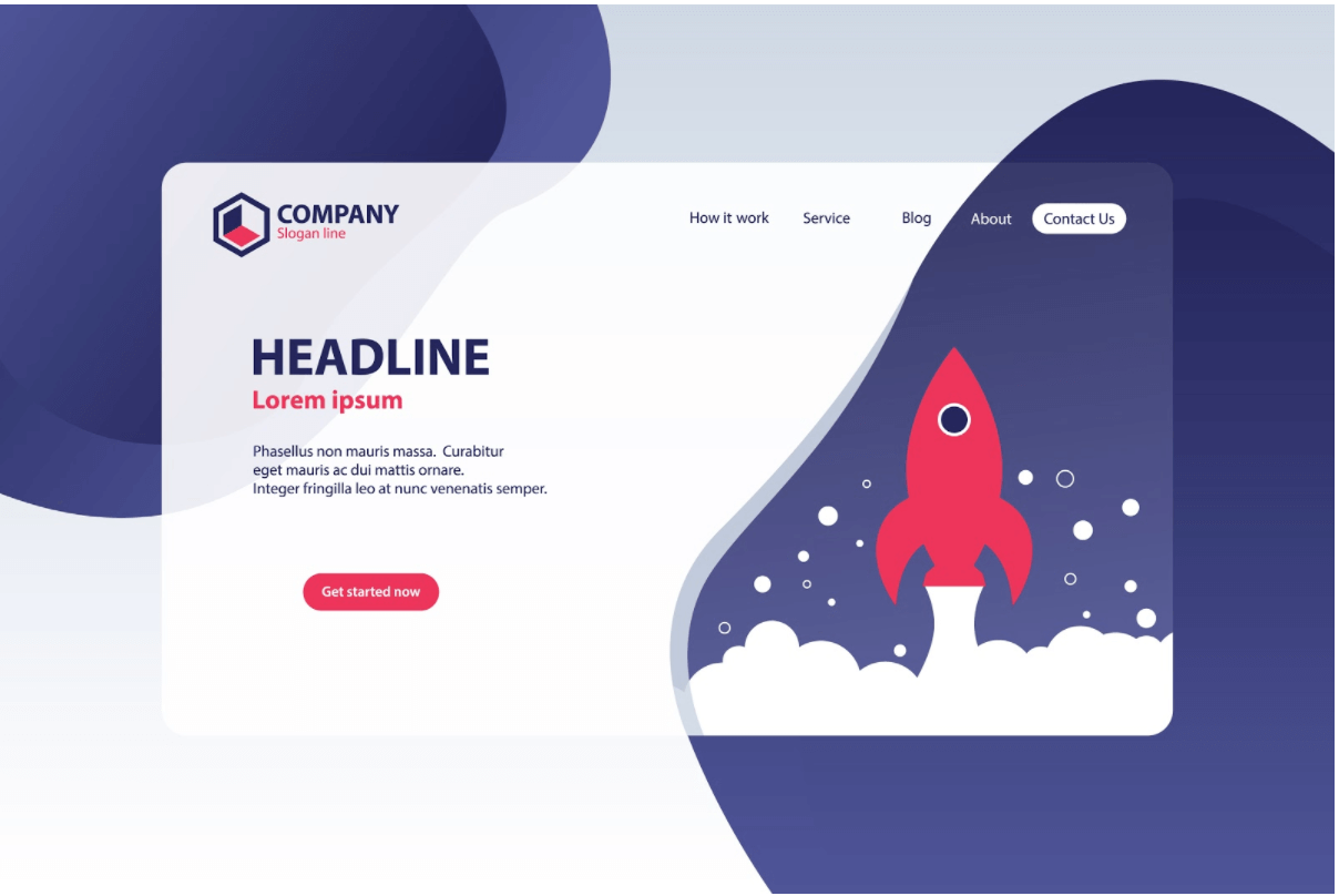
A landing page should be focused on a central action you want visitors to take. The page should feature a teaser or headline with minimal text, minimal (or no) navigation and a clear call-to-action link or button. The following image shows a landing page where the main conversion goal is “Get Started Now.” Immediately, the eye is drawn to the red button at the center of the page.

Page Load Speed
With the ubiquity of mobile, page load speed is an important consideration with all web pages, not just landing pages. But it is even more critical when you’re trying to get people to take a specific action (and you’re paying to get these people to your website).
Google places a lot of importance on page load speed when it organically ranks a web page, but page speed also influences your Google Ads quality score – a variable that impacts the rank and cost of your ads in the paid search results. Unbounce reports that pages with faster load times have consistently higher conversion rates than slower pages. You can test the load speed of your page using Google’s free page speed tool.
Page Layout
The layout of a landing page should guide the visitor’s eye to the desired call-to-action. Even when there are other links or buttons on the page, the main goal should be front and center.
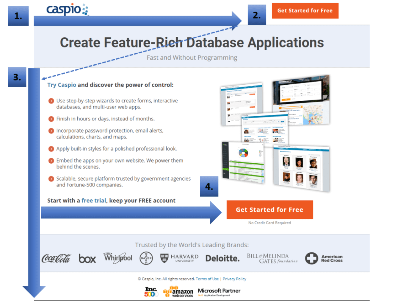
In the above example, there are several other links on the page, but they are muted compared to the red call-to-action button. The following landing page from Caspio, a software company that provides database services, is an example of a typical landing page layout that is focused on getting visitors to take one clear action.
The Caspio landing page employs many key elements of good landing page design, including the “F Layout” which has been proven by eye-tracking studies to be the natural way a visitor’s eye moves across the page (e.g., from left to right then left again). The layout and colors on this page are all designed to draw the eye to the bright orange call-to-action buttons.

Build Trust
Listing familiar logos and badges, customer testimonials, and certifications from reputable sources (e.g., the Better Business Bureau) has been shown to increase conversion rate by about 1 percent compared to pages that don’t have any of these elements. Most companies add logos and certification badges in the footer of the landing page, but these can be placed anywhere on the page as long as they don’t distract from the main conversion goal.
Word Count
Unbounce reports that landing pages with too much copy convert at a rate of 11.1% compared to pages with less copy which have average conversion rates over 14%. But what does “too much copy” really mean? In the age of the endless scroll, that’s not an easy question to answer, particularly for B2B marketers who have complex products or services to sell with a long sales cycle.
A good rule of thumb is to put the call to action and any visual elements higher up on the page, with written content down lower on the page. Studies have shown that visitors don’t mind scrolling, so while it’s important to keep word count in mind, don’t make yourself crazy by counting every word.
Make sure you communicate the important features, benefits and information you want your visitors to know. It’s also important to have a solid A/B split testing strategy to see what converts best for your very specific needs.
Images and Videos
The human brain processes images 60,000 times faster than text. We remember images better than text and we tend to focus on human faces over everything else when an image of one is placed in front of us.
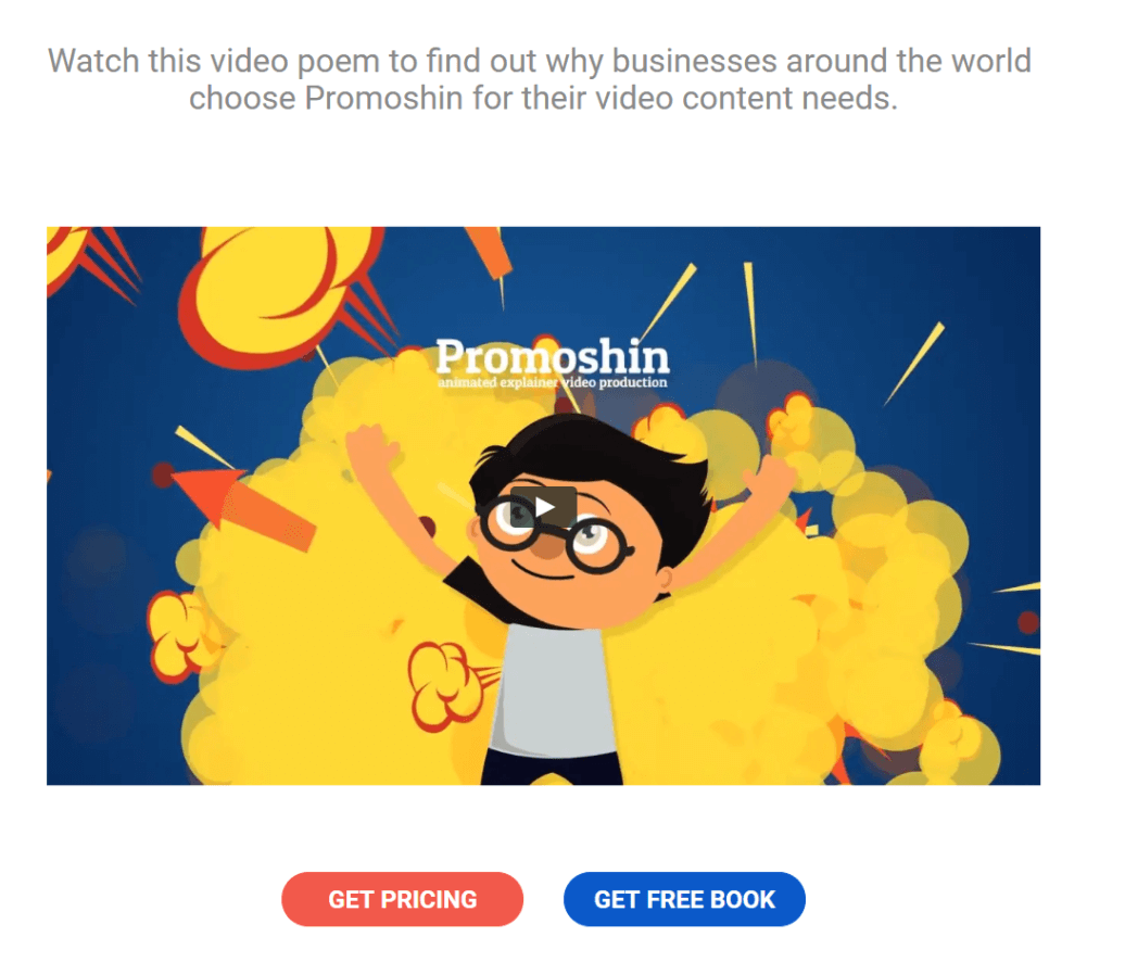
Adding a compelling image – often called a “hero shot” to a landing page has been shown to be the best way to convey feelings that drive conversions. Images should be unique (avoid stock photos), include faces, and be fast-loading. One study shows an 80% improvement rate on landing pages that utilized video compared with those that didn’t. Here is an example of a supremely simple landing page that features a video front and center (this company creates video content for their clients).

Conclusion
Like every well-planned out marketing tactic, landing pages should be integrated into your overall paid marketing strategy during the media planning phase. If your landing pages are no more than an afterthought – or worse – you’re sending all paid visitors to your home page, then you’re missing out on a huge opportunity to increase conversions. There’s even an acronym that describes the process of optimizing your landing pages for conversions – CRO (conversion rate optimization).
The most successful advertisers don’t simply have one or two landing pages – they consistently create, test and optimize their landing pages so they get the most from their media dollars and the best conversion rates compared to their competitors.


