New firms, companies, and startups appear every day. At the same pace is growing concern for good web design, but it is still a process that needs to be much more developed in the minds of new entrepreneurs. It is up to us, whether we are partners, owners or contractors, to show the importance and the solutions that a strategic web design will make a good contribution to the company. So here are some tips and possible adjustments that can be made to the small business website that will bring good results in a relatively short period of time.
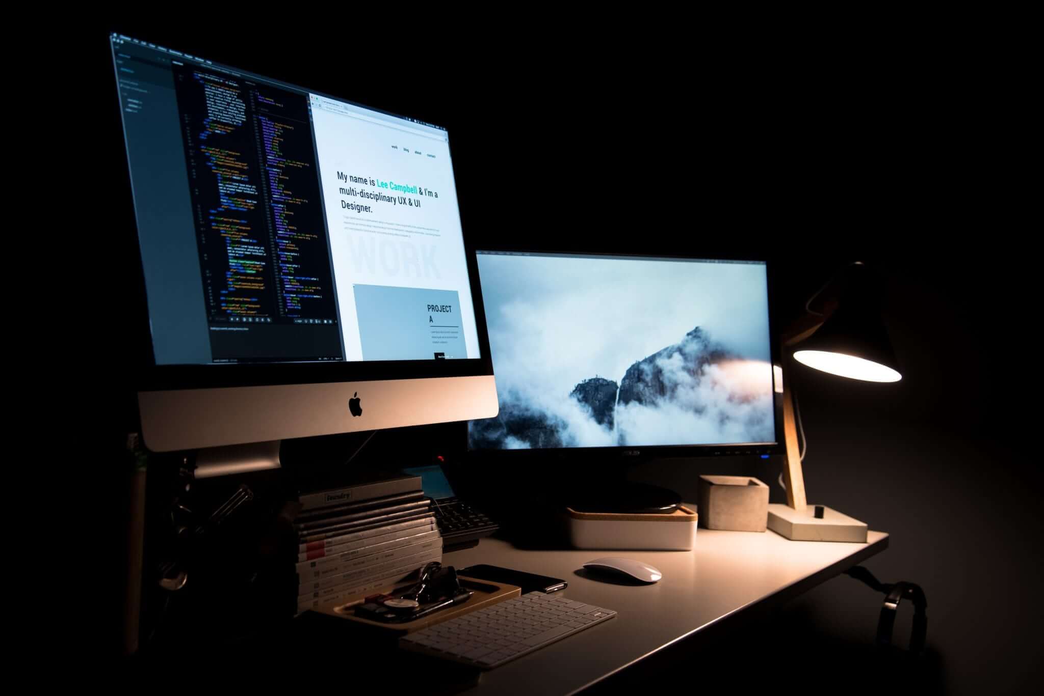
Keep It Clean and No Mess
The world around us has become quite confusing and the web is no exception. So why not give your visitors a break from all this noise and disorder? For a good design try to adopt simplicity and a good organization of the content. Value white space and visual content as they are critical to a good visitor experience on your site.
Content Needs to Be Easy to Read
The text serves to provide information and answer questions before they are even made. So, do not make your readers narrow their eyes to read. Be sure to use colors that work well together and do not use very small fonts. It is also important not to use several different font types and always follow a pattern.
Harmonic Colors and The Identity of Your Brand
Nowadays, one of the most important elements for any and every design is color. Colors are present in everything around us and make all the difference in our lives. With your website, it could not be any different. When creating a website, you should consider how to work with the colors of your website. They can affect how visitors navigate and surf your site. The colors of your site should follow the identity of your brand. It is important to maintain a visual identity of all points of contact with your brand to make it easily recognized by your audience.
Intuitive Navigation
Of course, the site needs to be beautiful and attractive, but just as important, it should have good usability because it makes the user experience (UX) memorable and intuitive. Usability is the fact of not making your user think, that is, the navigation should flow naturally and be easy to locate the information needed so that he/she can complete a purchase, fill out a form, know his/her products etc.
A good tip is to leave the navigation icons clear, well positioned and the texts should support them. Good navigation can influence conversions and the final purpose of the site. Understanding the intentions, desires, and expectations of the user is the best way to offer the best solutions.
Take Maximum Advantage of Mobile Version of Your Site
More and more users surf the internet via the mobile phone, and for many users, it has become the main channel for access to information. So, it’s critical that your site is tailored for mobile devices. The design must be thinking so that the navigation continues being simple, objective and functional for the use of these devices.
Use A Visual Hierarchy
If you create a “sign up now” button, you probably want as many people as possible to click on it and complete the sign-up process. The visual hierarchy tells us that the eyes move from top to bottom, from left to right. This means that you will get more attention for your button if it is in the upper left corner of your site, which can mean more clicks. All content on your website must have a consistent visual hierarchy, where the viewer can readily see the most relevant information. To facilitate a good hierarchy of information, use different font sizes and colors for titles and texts; icons and lists for easy reading; plus, visual and well-organized information on your page.
Apart from these tips, there are some common web design errors which need to be prevented when developing a website for small business:
Use of Sources That Are Difficult to Read
Using the appropriate font for comfortable reading is very important in maintaining visitor retention on your site. All other elements (images, graphics, etc.) are important to make content pleasing, but it is the text that the visitor sought when researched on Google. This is what should be prestigious, because, you heard that the content is the king.
Ignoring Images
Just as the choice of font is important to make the content enjoyable, the use of the image helps to give more support to the text, making it more explanatory. Always use images when you want more enjoyable reading text. But, remember not to use excessive images, as these will also determine the loading time of the page.
Long Texts Without Paragraphs
It is recommended, paragraphs with 4 or 5 lines to make comprehension easier, as larger paragraphs make it difficult to read on the computer screen. That way to increase the understanding of the content of your site always use this rule.
Font Size of Content Too Small
What is the ideal font size for the computer screen? This size should be from 16 px, the default in browsers. Very small fonts make the text read on the screen very uncomfortable, of course, people can increase the size of the letters in the browser, but keep in mind that this experience is not practical at all. Large letters make text easier for older people to read.
Text Over Very Colorful Background
The best background for text is white, as this is the relationship people are accustomed to reading content, whether on the screen or printed. But if you need to put text on a background image, always try to use an area that allows high contrast, as this makes it easier to read, otherwise reading will be greatly impaired, making comprehension difficult.
Much Publicity, Dispersing or Interrupting the Reading
We know that some blogs survive advertising, nothing is fair, the question is the amount of advertising that in the end, the visitor does not see and that disrupts the sequence of reading, with interruptions. At other times, there are so many attention-grabbing points that they end up “fading” the page they are on, causing some visitors to give up the visit. What is needed is to find a balance between the revenue of the Ads and the content, which is the reason for the visit.
Undesirable Popups
In some cases, even if the visitor enters the site and asks for something: likes or newsletter subscription in exchange for a digital bait (e-book) etc. We know how annoying the popups are, because, in some cases, it is even difficult to find the button (x) to close.
To conclude, choosing a good web designer is a very important and a challenge for most people. It is important to find a web design that meets the demands of programming, that is, your site is made in the right measure and according to your needs; and also, UX (user experience) design, so that your site, as well as beautiful, provides a great experience for its users.