Email is one of the most powerful marketing tools. Despite its advanced age, it shows high efficiency.
According to HubSpot, this source generates $38 for every $1 spent. The numbers are impressive and definitely pushing to develop this channel. Like any other tool, electronic marketing works well only with a competent approach. High conversion mailing is not possible without high-quality visualization. In this article, we will talk about the secrets of selling design letters.
1. Use grids to create a quality user experience
The key problem of most letters is a huge number of distractions. The user does not understand what to concentrate on. Thus, the design distracts the visitor from the goal. To solve this problem, we have developed special templates that allow you to create a letter structure that ensures the effectiveness of email marketing. They provide a marketing-friendly user path leading to targeted action.
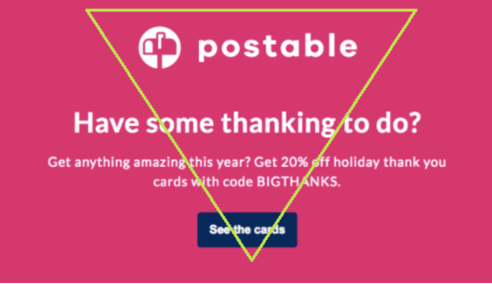
Inverted pyramid
A grid designed to attract the attention of visitors. The pyramid consists of a heading, which makes it clear the essence of the newsletter and images. The bottom line is that such a scheme ultimately ends with a call to action. This is a fairly simple but effective method at first glance. It does not distract the user and therefore leads to the desired action. Therefore, if you want to create a conversion letter in a brief time – this is a pleasant option.
Zig-zag layout
Ideal if you need to place a lot of information in one letter and keep the interest from the user. You can achieve the zigzag effect using images and highlighting. This approach will help to create a user path by letter. The advantage of this mesh is that it simplifies the perception and looks attractive.
Use grids to ensure good readability and direct the client to the desired action. It brings results, because it captures attention, and this is the major thing for the email newsletter.
2. Drive action with eye-catching colors
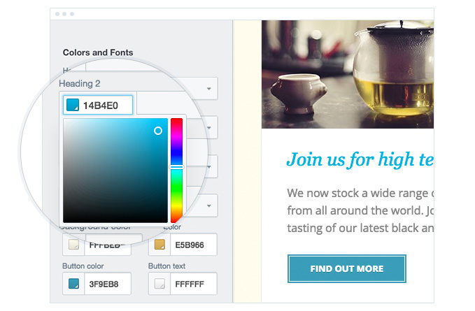
High conversion emails contain high-quality and eye-catching images and colors. Using corporate colors and fonts is an excellent move. To create a better effect, your design must match the visual concept of the brand. This allows you to build associates, trust and make your newsletters presentable in the long run, and as a result, improve conversion. Thus, your letters will be recognized and more involved to respond to them.
3. Engage emotions with images
Today everyone says that emotions are a key component of consumer psychology. Understanding how this works can succeed in everything. Email marketing is no exception. You can use high-quality images of your product, but you can go even further. Create visual images that evoke the right associations. For example, your product is a delivery of elite bouquets.
Let users feel, looking at the screens of their devices, luxury and shake, from the acquisition of your product. “You remember that people do not buy goods, for the sake of goods, they need emotions. Indeed, with the same success, you can buy a bouquet of roses from another brand twice cheaper.”
4. Take care of adaptability
According to the study, an average of 54% of emails are opened on mobile devices. For those who want to improve the effectiveness of email marketing, this says one thing – you need an adaptive design. Make it as readable as the desktop version.
Check if all the elements are in place, if the buttons work and if they are in the part visible to the user (we strongly recommend checking all possible versions. For example, if you checking your ubuntu version, it may turn out that the letters are not adapted for). Importantly images must be adapted and opened.
5. Add GIFs
GIFs are a fun image format that won’t go unnoticed. They cause emotions and if you consider the target audience when choosing the right animation, success is guaranteed. Dynamic images concentrate on themselves.
This helps to increase the scanning time of the letter by the user. There are a lot of options for using this type of image. Show the product in action, focus on a specific part of the message or add something cute and funny. Without a doubt, just turn on the fantasy and you will receive an email with a good conversion.
6. Different design for segmented campaigns
Creating shared emails for different audience segments is a fatal mistake for most companies. It is very important to move from an outdated approach to email marketing and accept reality. Modern mailing tools allow you to sort your audience according to specified criteria. You can send relevant messages to each user group now, and you cannot miss this opportunity. You can take previous actions into account, which is especially valuable.
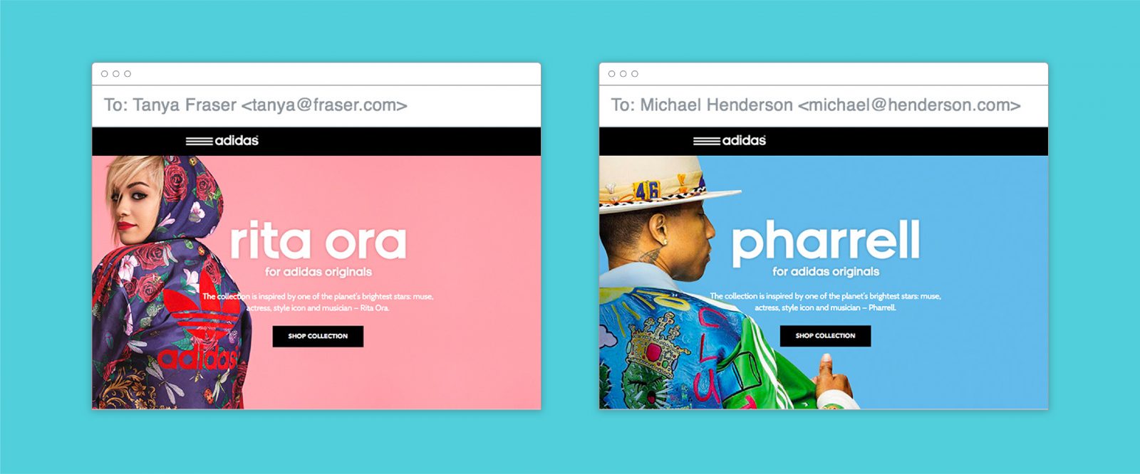
Thus, create for each segment, your design and message. This will help to personalize emails, which means increase conversion. Adidas ad campaign shows a good example.
Here the campaigns are focused on two segments: men and women. Thus, each audience received newsletters in a single design, with identical messages, but with minor changes that take into account the characteristics of consumers. This approach allows you to increase the engagement and scanning time of the newsletter. From this, it becomes clear why creating shared mailings is a bad idea.
7. Create accents and visually break content
Use spaces to stress the right areas. Properly placed elements provide good readability, information is perceived easier and the user correctly moves along the chain to the target action.
If the letter contains a lot of information, divide it into sections. There are many design techniques to do this. For example, horizontal borders and geometric shapes do an excellent job of such a task.
Such a solution will help to get a return, even where the user opens the letter, viewing it in a matter of seconds, and this is 80% of all recipients. The presence of a well-thought-out structure makes it possible to highlight the key information and concentrate on it. Therefore, even in such a brief time, the consumer can understand whether the letter bears value for him, and not just close it, for no reason.
8. Experiment with fonts
Using multiple types of fonts is a splendid way to put emphasis and attract attention. You can combine bold and thin fonts. For example, a bold font is perfect for a title, and for the body text – a thinner one and Sans serif. This will ensure readability and emphasize where necessary.

9. Simple design
The fewer the details, the less likely it is to lose customer attention. Minimalistic design is one of the best ways to bring the user to the target action. Avoid lots of colors and elements. There is a fine line here when the content is bright and effective, and when there is too much of everything, and it becomes useless.
10. Make an outstanding call to action design
The key aim of email marketing is to drive traffic to your landing page. The call to action is responsible for this. You can create the most outstanding design and structure, but if your CTA is weak, blurry or absent, the efforts will be in vain.
Of the options, CTA can lead to – an online store page or a blog post. The call to action will vary depending on the landing page and tasks. The number of clicks will talk about how well you worked on the letter and took into account the characteristics of the target audience.
To make CTA visible and effective, you need to consider the colors and its placement. We want to draw your attention to the fact that there are a lot of approaches to this.
For example, some experts believe that it is better to put a call to action at the beginning of the letter, so as not to disperse the attention of users. On the other hand, there is an opinion that first, the main emphasis should be on the content, and after that, the CTA should stand. The essence of this approach is to be useful to consumers, and in return, they will come to the target action themselves. What to do? There is no definite answer. The best option is testing. Create designs, change the location of the CTA, and see what works for you.
Use other colors to highlight a call to action. To make it more visible, it is better to give preference to the button than the usual hyperlink. This will make the content not only more attractive but also more noticeable.
Conclusion
The design of emails affects the conversion, so it is important to pay due attention to this. Use grids to control the user’s attention properly, refer to bright images and colors, and do not forget about the CTA. Remember, performance requires constant testing. Do not stop there, track the reaction of the target audience, and draw conclusions. You will achieve the desired result only this way.