One of the most important pieces of the content marketing puzzle is your landing page.
Landing pages have a number of benefits. They help you direct a targeted and succinct message to your prospects, they help you track the success or failure of your marketing initiatives, and they provide a custom made corner of the internet in which you can test out various strategies.
Of course, a landing page is only going to work if it’s a good landing page.
But what makes a good landing page?
To answer that question, we’re going to have to dissect the anatomy of a solid landing page piece by piece.
First, we will talk about what a landing page is and, more importantly, is not. Then we will move on to a list of six items you have to have down if you want a successful landing page with a high rate of conversion.
What is (and is Not) a Landing Page?
A landing page is a section of your website that a user would access through a hyperlink found on either another page, an ad, or through a search engine.
When creating your landing page, it’s important that you don’t get it mixed up with other web pages.
For starters, a landing page is not a product page.
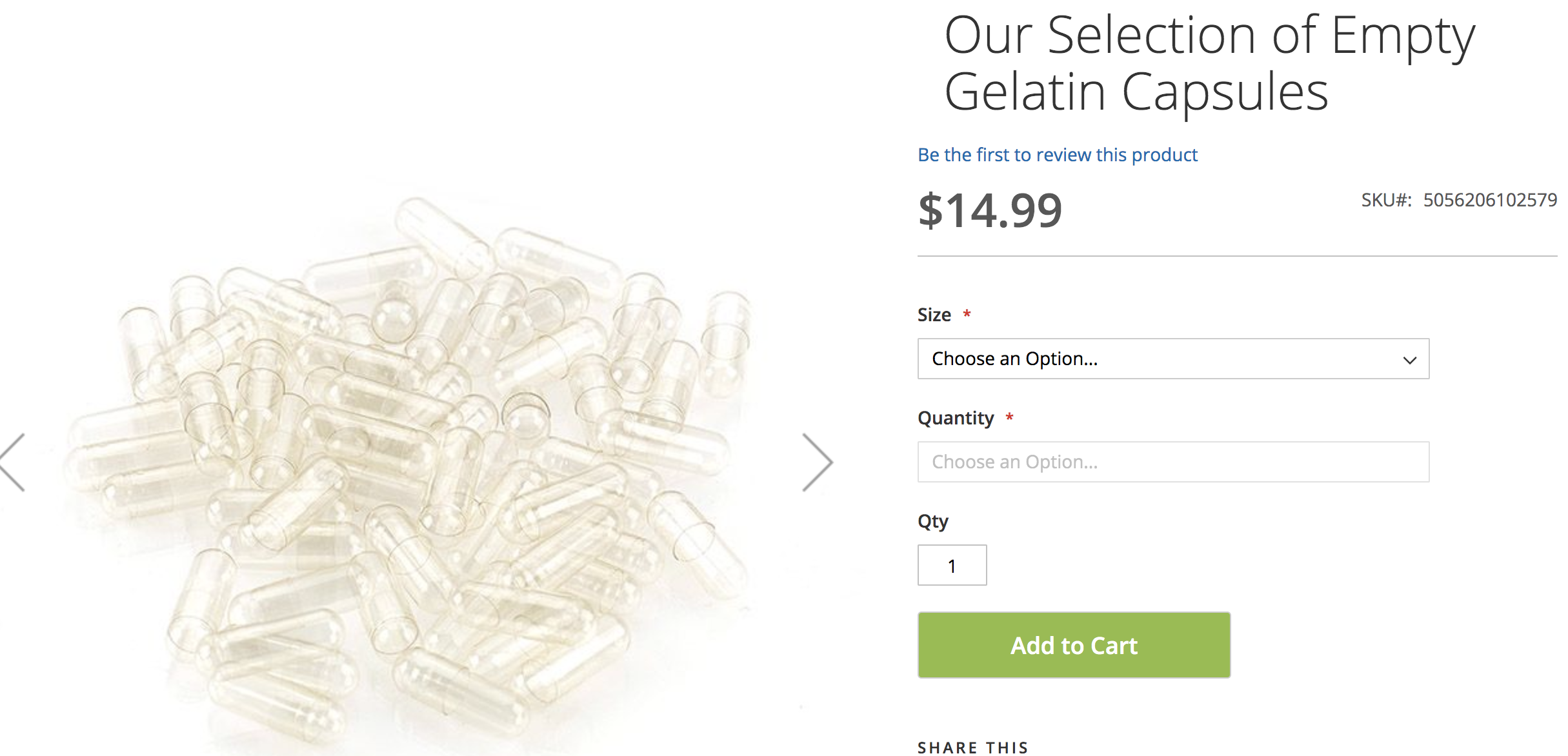
This is a product page from LFA Capsule Fillers. It is a page that highlights a specific product and gives you an opportunity to make a purchase.
A product page should never be a landing page. The landing page is your opportunity to make a solid first pitch to a prospect. You don’t want to just shove a product in front of them and expect them to buy.
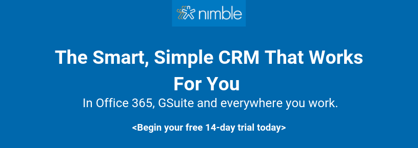
A landing page should also not be your homepage.
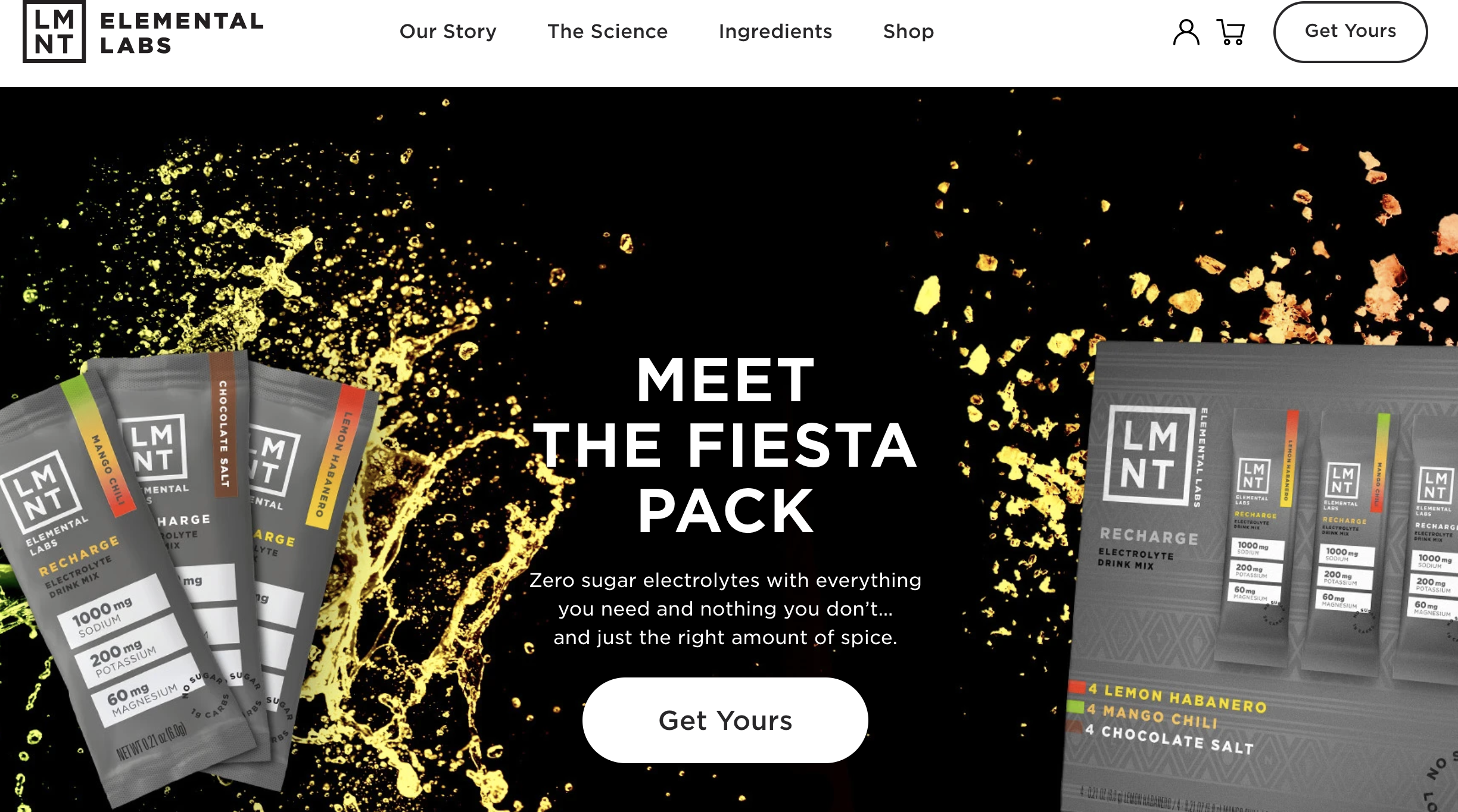
A homepage, like the one pictured above for LMNT Elemental Labs, has a lot more information than your average landing page. On a landing page, you’re going to have to focus on a specific message.
When you’re trying to make a point or drive a promotion with a landing page, one of the worst things that you could do is overload your audience with too much information.
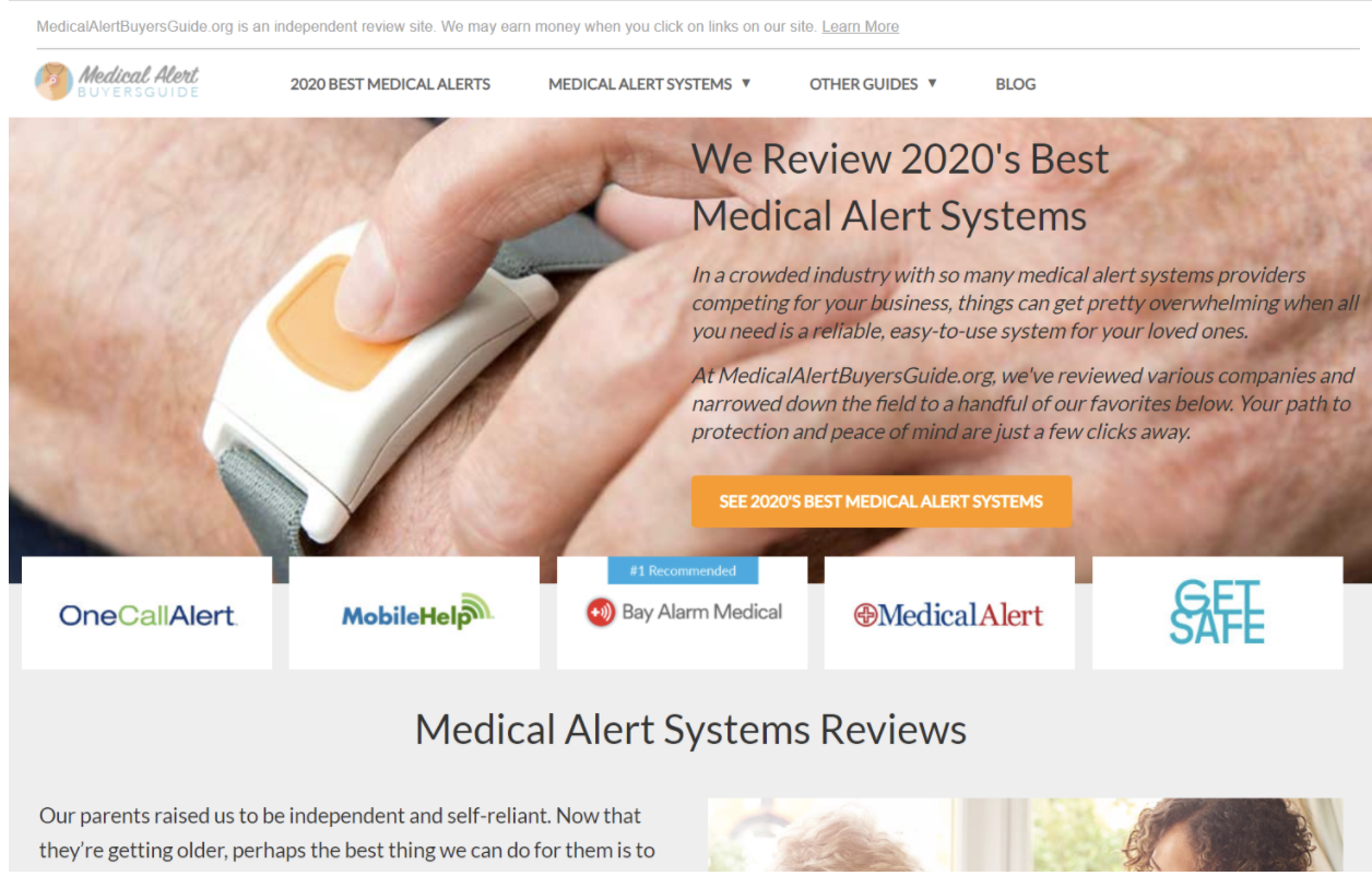
Here’s another example from Medical Alert Buyers Guide. This is a great homepage but it would be an insane amount of information to add onto a landing page.
1. Use Images, Videos, and Forms
A landing page should never just be a wall of text. You want to make sure that the page in question is eye-catching and is making use of all forms of media, including video content and images.
Why is that?
Text is boring! And people take in visual content far easier than they do the written word. A staggering 45% of people watch at least an hour of videos online every single day.
Your prospects should be able to understand the main idea of your page from just a glance.
Forms are a perfect addition to any landing page because you want to gather as much prospect data as possible. By giving your prospect something to fill out, you’re encouraging action while still collecting valuable data.

This example from ManlyWellness is a perfect representation of what a landing page should be. The text is broken up by a large image, the colors are bright and eye-catching.
2. Consistent Branding
Your landing page has to be filled with your company’s specific branding.
You work hard to customize your brand image, and it’s one of the ways that customers come to trust you. The colors, fonts, logos, graphics, and images that you use in your online presence become synonymous with your company.
Take the golden arches of McDonald’s, for example. That specific logo and those colors are so intrinsically tied to that company. Just seeing them together elicits memories of in the minds of customers all over the world.
Your landing page has to remember this.
If a prospect clicks over to your landing page and finds a different color scheme or a logo that was inconsistent with your advertising, social media, and website, they’re going to think that they landed on the wrong page.
It’s definitely an eyebrow-raising moment when someone clicks onto a respected and known company’s landing page and the branding is suddenly wildly inconsistent. Remember, you’re trying to put the minds of your prospects at ease and establish trust. Consistent branding is a major part of the trust that is built between the company and the consumer.
An inconsistent landing page would be like going in for a meeting with a contact that you’ve known for years, only to find that once you step into the conference room, it’s someone completely different.
3. Clear Benefits Statement
What is the end-user getting out of your landing page?
That’s something that has to be established right from the get-go.
After all, prospects aren’t going to do business with you because they want to help out an up and coming company. They have to get something out of it. You have to let them know that when they purchase from you, they’re getting something excellent that they would never have gotten by siding with a competitor.
So, how can you do that?
The first and most obvious place would be your headline.
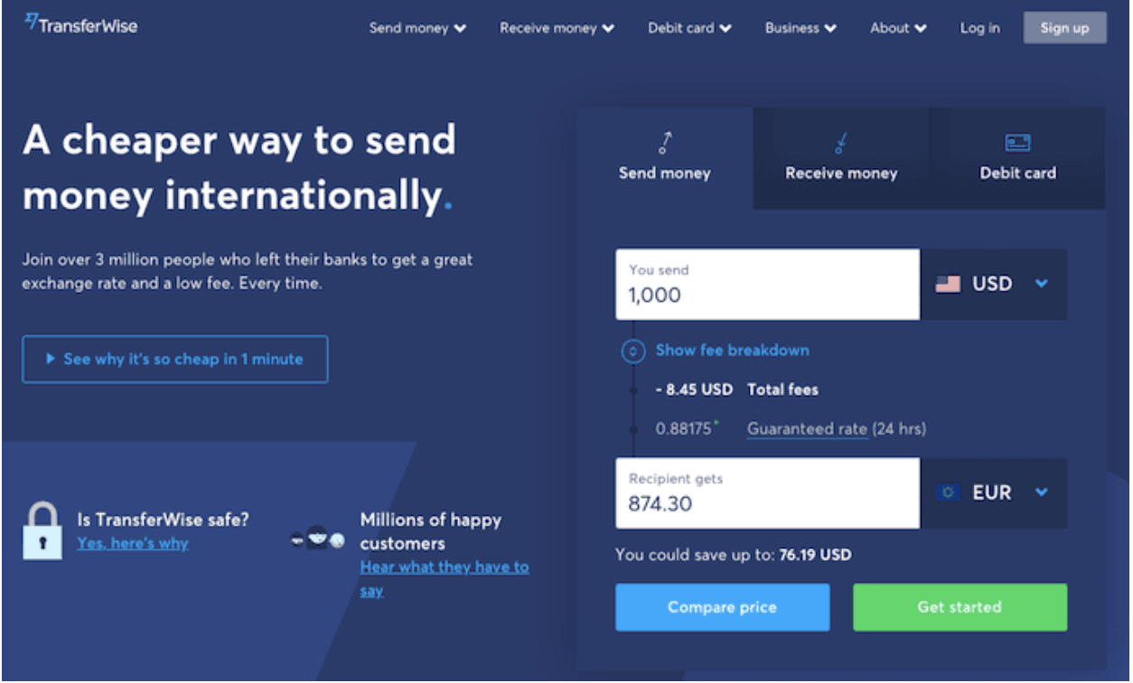
This example from TransferWise shows the concept perfectly. Here you have a headline that speaks directly to the heart of the matter.
You know that if you go with this service you’ll be able to send money internationally at a lower cost.
Beneath that there’s a link that gives you more information. Then at the bottom of the page, you’ve got both customer testimonials and the answer to one of the most frequently asked questions one might have when transferring money.
4. Social Proof
In the TransferWise image above, you’ll note that at the bottom of the page, it references “Millions of Happy Customers.” It then has a CTA link inviting you to hear more from these people.
That’s a perfect example of social proof at play.
Social proof speaks to the trust that shoppers have in their peers. More prospects will believe the review of a peer than they will the messaging supplied by a company.
By listing customer testimonials on your landing page (or in this case, linking to them) you’re providing your audience with that social proof they so desperately need.
You’re enriching their experience and building trust through a third-party review. Prospects can look at your satisfied customers, who are often people of the same demographic with similar pain points, and picture that success as their own.
List some text-based testimonials, but make sure that you’re including the testifying person’s name, occupation, and headshot along with the review.
If you have the space on the page, consider one or two video testimonials, which can really shine a positive light on your entire company.
5. Calls to Action
You need strong calls to action on your landing page.
The point of the page is to guide prospects towards a specific action. That action is suggested in the call to action.
Something as simple as “Click Here And Save 25% On Your Next Order” is a strong call to action.
You’re establishing value while urging the user to take action.
Placement is also a huge deal when it comes to a CTA.
You want to make sure that your CTA button is large, stands out on the page, and is centrally located in a place that the user won’t be able to miss.
6. Direct Immersion Strategy
One of my favorite landing pages of all time is Preply:

Preply is a site that connects you directly with language experts and tutors. And they do it well.
Notice how Preply doesn’t dive into a whole spiel about how they are the best, or what features they offer.
Instead, they directly immerse you into the platform from the start:

Asking you a direct question, they are speaking to you, not at you. They aren’t trying to convince you to buy, they are engaging you directly.
Directly immersing someone into your offering is tough to do, but Preply nails it.
In Conclusion
You need landing pages for a number of reasons. However, if a landing page is not laid out correctly, using these six major elements, it’s going to do more harm than good.
When in doubt, it’s better to trust your landing page creation efforts to professionals. You can outsource your landing page design and creation to a freelancer, who is intimately familiar with all of the elements of a highly converting page.
Ensure that your landing pages are developed the right way and you will see a major boost to your conversion rate across the board.